2020 has been a funny old year so far, even in design. Did you know the Pantone colour of the year is the ‘calm’ Classic Blue? That might make you feel a tad bit… blue. So what’s in store for 2021?
It has been two decades since classic blue was the Pantone colour of the year, and this year’s choice of a colour that represents ‘confidence and stability’ is well, almost enough to make you chuckle. But there is hope: the Spring 2021 colours are fabulous! Incorporate these shades into your custom packaging to brighten up your customers’ spirits for the new year.
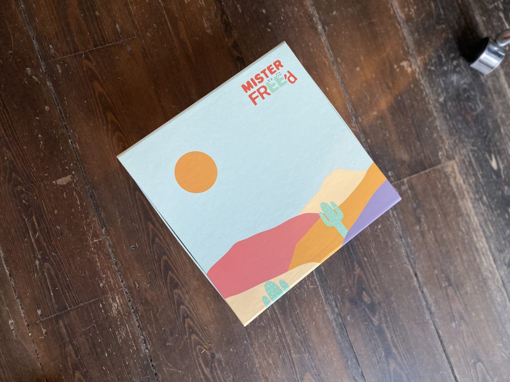
Marigold & Cerulean
Sunny, warming marigold is a great accent colour to use in your packaging. And crisp and clean cerulean blue is a great backdrop for a beautiful blue sky. Take a look at how our client Mister Freed used these shades in their sunny boxes:
Rust
Rich, luxurious rust is a comforting and classic colour that resonates with almost any audience. See it in action in these fabulous custom boxes for Rival Sons: 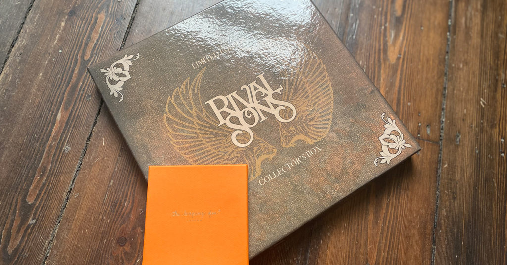
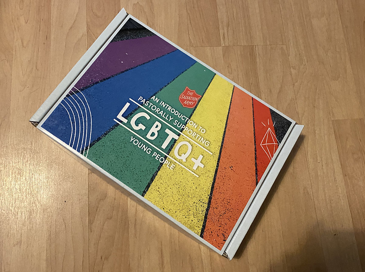
‘Illuminating’
Described as ‘optimistic yellow’ by Pantone, this bright and electric shade is sure to bring in that wow factor!
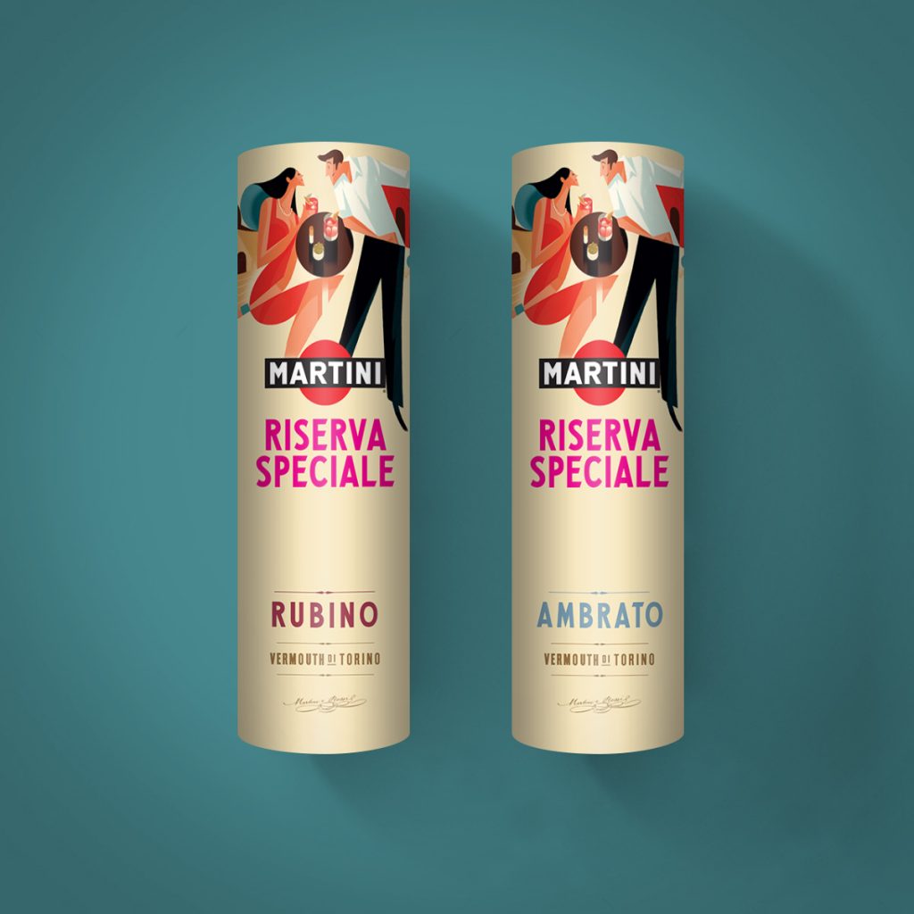
Buttercream
Warm, neutral buttercream is a classic shade that works with almost any other colour palette. See how the colours pop on these gorgeous boxes for Martini:
Whatever colour packaging you’d like, we can design it. Try out our online box designer tool to explore some options and then contact us to request your custom packaging for 2020 or 2021!
Back to Blog