The impact of colour psychology in packaging blue our minds! Learn what different colours symbolise and how to make the colour of your packaging work for your brand.
When designing your package, one of your top considerations will be the colours you’re using, which can really say a lot about your product! Packaging is the very first thing customers notice, and when shopping, first impressions are important. Customer decisions are heavily influenced by the colour of your packaging.
According to KISSmetrics, 93% of consumers base the appearance of the product as the deciding factor in making a purchase. Plus, colour increases brand recognition by 80%!
The colour you choose for your packaging can tell your customers how to feel and should be relevant and complementary to the product you’re trying to sell.
So, what do colours in packaging signify?
Red packaging
Bold, passionate and adventurous, red packaging triggers powerful emotions and creates a sense of urgency. It can also make consumers grow an appetite, which is why red is often used in food packaging!
Orange packaging
Warm, cheap and earthy, orange packaging is bright and non-corporate. Orange is often used for brands in tech, food and energy.
Yellow packaging
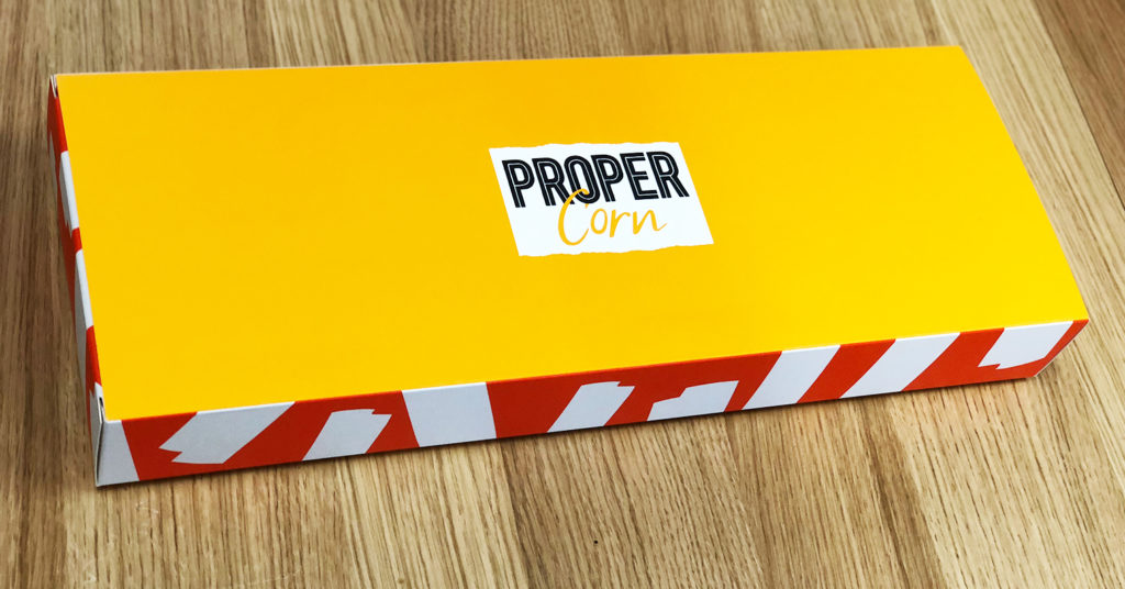
Packaging that is yellow is often meant to induce positive, impulsive feelings as it represents fun and creative vibes. Yellow is most powerful when used as a complementary colour as a pop of colour.
Green packaging
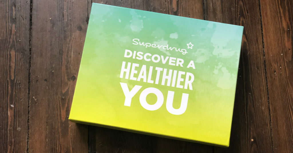
Trustworthy, hopefully green is often used to represent health and prosperity and is one of the most popular colours used in packaging. Green represents life so it is synonymous with power, money, health, growth and nature.
Blue packaging
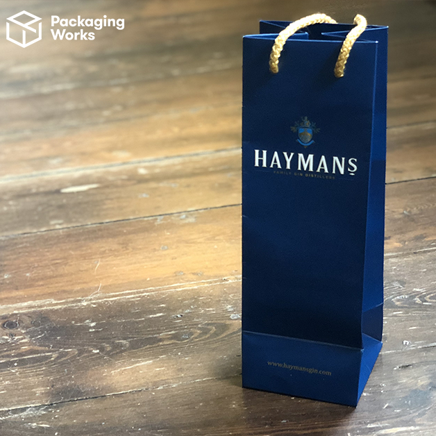
Calming, wise, trustworthy blue – the colour of reason. This is the most ‘expensive’ looking colour which is why many big brands – ie Visa – use it in their branding. Choose blue packaging if you want to portray luxury and trust, but make sure you will be able to stick out amongst competitors. Choose another colour if you’re selling food: blue suppresses the appetite because there aren’t natural blue foods!
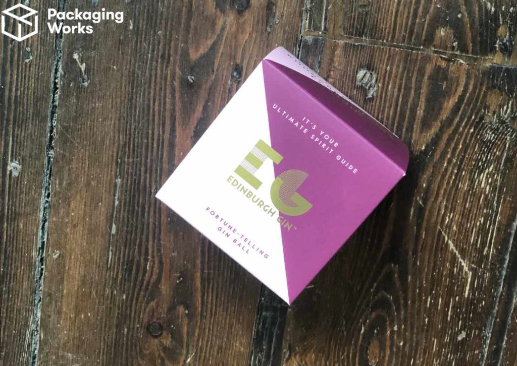
Purple packaging
Spiritual, imaginative purple packaging is extravagant and moody. It’s also dignified and associated with royalty, so use this if you’re aiming for prestige.
Pink packaging
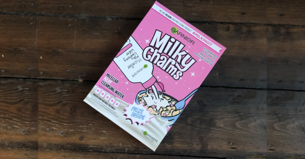
The stereotypically ultra-feminine pink is a positive, quirky colour used to evoke excitement and feelings of youth. Another great complementary colour in packaging, it can be used to evoke feelings of imagination and fun. It doesn’t need to be limited, however: pink packaging can make you brand stand out if used provocatively.
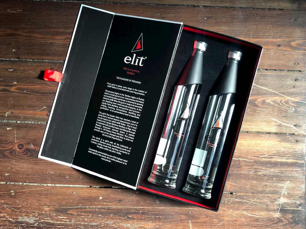
Black packaging
Luxurious, powerful black exudes confidence and stability. Black represents decisiveness, simplicity and elegance. It’s one of the most popular packaging choices for our customers.
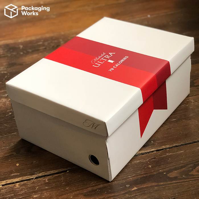
White packaging
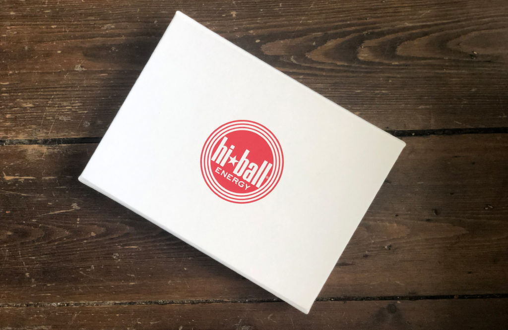
Modern, pure white packaging is sleek and precise. Its innocence makes it represent cleanliness, innocence and simplicity. White packaging requires a designer’s eye to ensure it doesn’t look last.
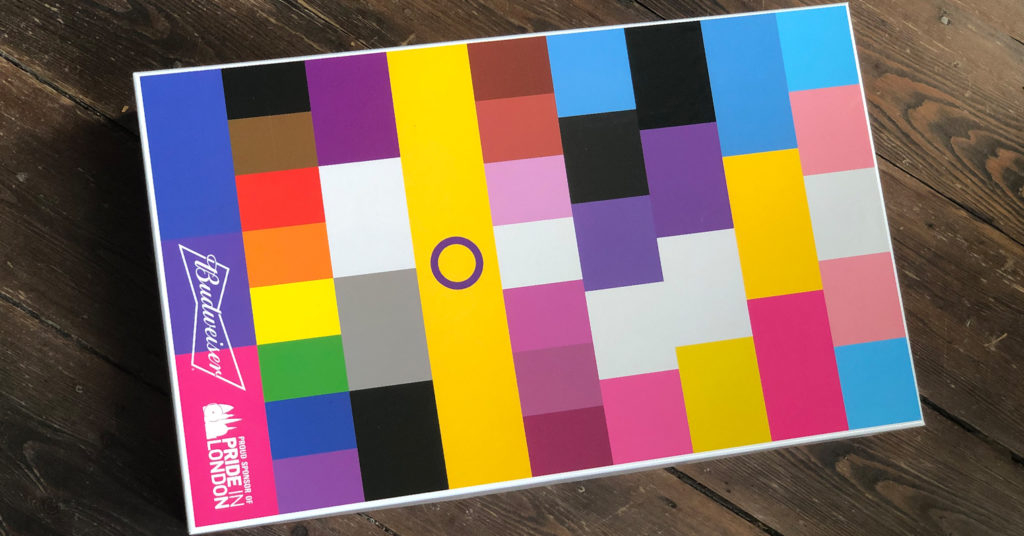
Rainbow packaging
2019’s Pride Month saw a huge surge in brands showing support for the LGBTQ community by adapting rainbows into their branding, products and packaging. It can be great to make a positive statement with your packaging, but do so thoughtfully and responsibly! Learn about Budweiser’s pride cups campaign which we designed bespoke boxes for.